Typography
Calligraphy has always been a part of my artistic practice—here are some examples of my letterforms working in the design and digital realms—working typefaces.

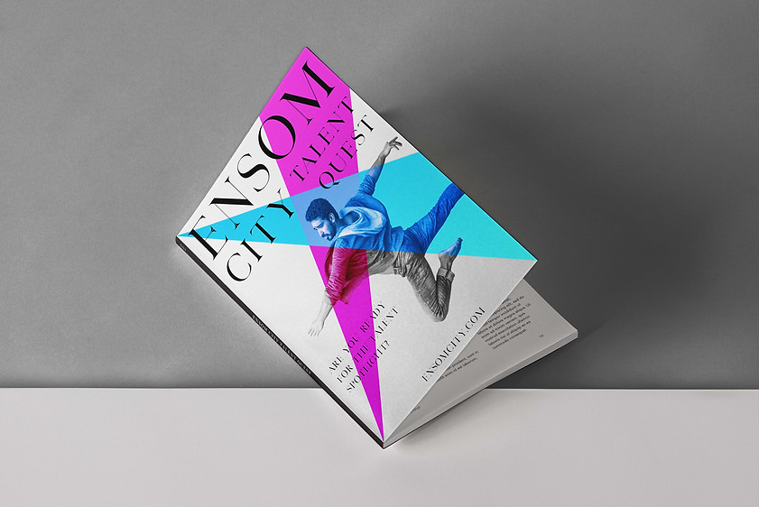
Split Serif is a display style typeface I designed inspired by iconic high-contrast designs used frequently in editorial publications such as in Vogue and Architectural Digest. Using a split line on certain thin strokes I was able to create something subtly unique when used in a heading size, while maintaining striking difference in a display setting.

Specimen of entire alphabet, and my favorite letters in display size.

Example of the Split Serif used in an editorial setting for a project.

MLCyrillic is a typeface that I designed inspired by an old Cyrillic set of type I came across in a typographical book. I used its style to create a functional font, as well as adapted it to the Latin alphabet for my own use in typography.

Specimen displaying both the Cyrillic and Latin alphabets of MLCyrillic

Source of inspiration.

Example of the font in use — Cyrillic Russian Ouija style spirit board.

Big Head is a typeface that I am creating currently. I was drawing letters as I often do for inspiration for calligraphy and other aspects of my life as a designer, and I created this letter A. I liked it so much I decided to begin creating the rest of the alphabet.


Specimen of the font's name as well as characters I have created thus far.
